-
KALEB KE于2019年在西班牙首都马德里诞生,这个鞋业品牌诞生之日起便遵循舒适便捷的完美脚感而不断创新其在鞋子生产领域的版图。今天我们为KALEBKE重塑了品牌形象,一个更年轻更时尚的国际品牌应运而生。KALEB KE从早期做洞洞拖鞋和日常拖鞋起步,逐渐将跨入休闲鞋及休闲运动鞋板块。更贴合更舒适的脚感,同样更加时尚和简约的造型是未来KALEB KE在产品方面创新的苛求。

关于定位:舒适新足潮
sologn:More comfortable and perfect


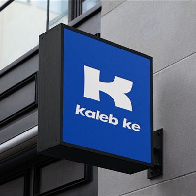
设计风格:品牌以蓝白色系出现,呈现更加鲜明更加清爽的品牌调性,标志图形则以KALEB KE的“K”英文字母作为变形,我们在“K”的结构上进行了优化设计。调整了曲线细节,以使logo看起来更加流畅和具有运动感,符合该品牌产品的基因属性。标准字在Futura的基础上进行了修改设计,使它更符合标志的整体性。同时采用小写,便于消费者阅读,记忆,最终熟悉。
Design Style: The brand appears in blue and white, presenting more vivid and refreshing brand tonality. The logo is distorted by Kaleb Ke's "k" English letter. We have optimized the structure of "K" .The curve details have been adjusted to make the logo look more fluid and Sporty, in line with the brand's genetic attributes. The Standard Word is a modification of the Futura design to make it more consistent with the overall identity of the logo. At the same time using lowercase, easy for consumers to read, memory, and finally familiar with.

大胆、运动、简洁、国际是我们认为符合kaleb ke的基因。辅助图形上则进行符号的重复化处理,达到更好的识别效果及品牌传播力。
Bold, athletic, simple and international is what we think Kaleb Ke has in his genes. Auxiliary graphics are repeated symbols processing, to achieve better recognition and brand communication.


KALEB KE 品牌形象延展


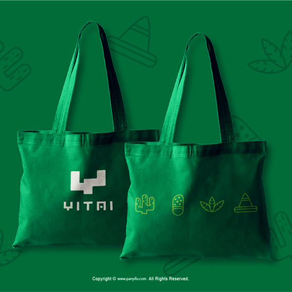
KALEB KE 物料延展


产品包装与海报
PACKAGE&POSTERS
-
包装风格沿袭了整个品牌的色彩与调性,通过重复的辅助图形及品牌标识的呈现,强化品牌符号,加深消费者记忆识别.
Package style follows the color and tonality of the whole brand, through the presentation of repeated auxiliary graphics and Brand Logo, strengthen brand symbols, deepen consumer memory recognition.


空间及延展
SPACE & PRESENTATION
-
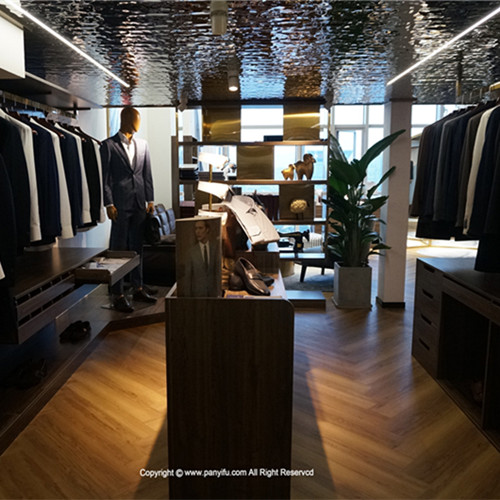
办公及门市环境空间依然沿用了品牌的主基调色彩及图形,简洁明了,最直白的符号既是品牌最好的放大器。
Office and store environment space is still using the main tone of the brand color and graphics, concise, the most straightforward symbol is the best brand amplifier.