▼
创意阐释
Creative interpretation
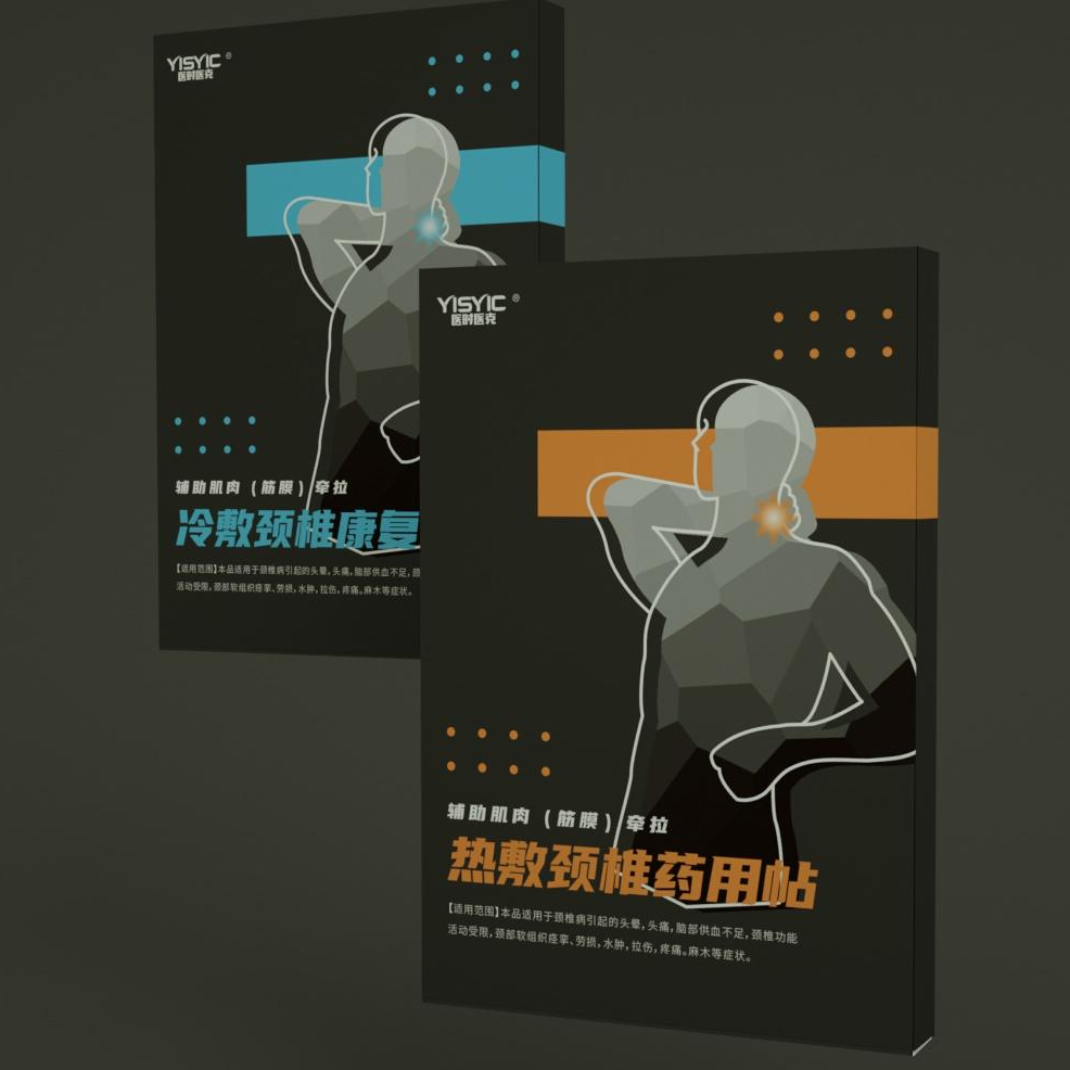
以黑色为主色调,给人以一种沉稳、大气的形象。同时封面的人物形象右手扶着脖子并在颈部着重强调,紧密贴合了产品属性同,一目了然地告诉消费者产品的用途,更加快速有效地传达了产品信息。同时包装设计上还采用冷色调蓝色代表冷敷,暖色橙色代表热敷,更加直观地体现了产品分类,提高消费者信息获取效率的同时加强了产品区分度。

Black is the main color, that giving people a calm and atmospheric image. At the same time, the character image on the cover holds the neck with the right hand and emphasizes it on the neck, which closely fits the product attributes, tells consumers the purpose of the product at a glance, and conveys product information more quickly and effectively. At the same time, the packaging design also uses a cool blue to represent cold compresses, and a warm orange to represent hot compresses, which more intuitively reflects the product classification, improves the efficiency of consumer information acquisition, and strengthens the degree of product differentiation.